
"How do you paint?" This is the question I am asked most often.
For me, it has been an evolution of years of "doing".
I'm not sure I can articulate how to paint.
But, I will show an example of something I'm working on today.
A work in progress, a tutorial.
Wendi's challenge ~ "paint with an unusual color palate-"
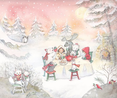
Step 7. (end of day 2) continued...
I'm using a split complimentary triad, using red (pink) the dominate color. *

Wendi's challenge ~ "paint with an unusual color palate-"
Step 7. (end of day 2) continued...
I'm using a split complimentary triad, using red (pink) the dominate color. *
image copyright Becky Kelly Studio, LLC all rights reserved
Day 2
Step 4) It is the second day.
 Today, it is time for some detail. This is the fun part. ......Ok, you got me... (it's all fun.)
Bears, penguin, scarves and dishware...details.
(details, trees and whites added)
Some things need more detail and I pick those things out.

 I don't like the line in the bears nose, I carefully pick the paper with a sharp knife to remove the dark line.

 I don't like the line in the bears nose, I carefully pick the paper with a sharp knife to remove the dark line.

The trees in the distance need detail, I block them in first with a quick wash, to keep loose, then I do more detail. I paint the trees a blue green gray, to look far away, and in the mist somewhat.*
*hint (color- a split complimentary triad) Use colors opposite on the color wheel. Then split the side opposite your dominate color to a few more "neighbor" colors. Example; Reds ( pinks) are my dominant color, on the opposite side of the wheel are green and blue hues. My grays have blue, cool color to make everything looks misty in the background.
Step 5) Next, Using a "non-bleed" white paint, drop in snowflakes and white details. The snowdrops look nice against dark gray.
It is ok if the whites are not perfect. This gives the art more character.
Step 6) I examine the work again. The tree over the moose head is overworked, I'll have to fix this in the next step. The moose needs some work...the foreground and details still need work.
Using the program Photoshop, I do another quick rough to color block my foreground. Will adding a dark foreground will give me the look I want? The center of the painting should be seen first, the foreground, darker. (like a frame)
Hmmm.... a snowman would have been nice, maybe next time?
Looking through snowy photographs, I'm reminded how the foreground could be brushy with thin icy sticks, a gray tone behind the fox and bear, (so they stand out) ... a soft warm gray. I'll try the brush next...
This area (fox and bear) will be my second story.
Below is a rough color block of what I have in mind.

hint* a computer program like Photoshop can help with color blocking.
Many people use Photoshop to add white elements like the snowflakes.
But these snowflakes can look to perfect. I prefer a white bleed proof paint because it is irregular.

5 comments:
very cool AND informative. glad i found your blog!
Thanks, almost 50... : )
Am trying to do some tutorials, it is new to me.
you're doing a great job with the tutorials- nice to see the thought process- challenges me to try this!
Thank you, I'd love to see your art piece when you are finished. But NO pressure! Art should be enjoyed.
Becky
i'll send you a message when i get it done :)
Post a Comment